Redesigning an app that will redefine fibro treatment
As San Francisco-based digital therapeutics company, Swing, had been completing the first series of clinical trials for their app, Tempo (now named, Stanza), they were starting to plan next steps into version 2—the brand and product’s visual identity and design.
I came on board with Swing as their in-house Design Director and Lead. To begin working on Tempo, I first had to familiarize myself with the cutting-edge world of digital therapeutics and its place within modern medicine. I then began my research into Swing and the current version of Tempo from a business and branding point of view. I worked closely with the Head of Product and the UX Designer to successfully distill all of the research findings, questions, answers, and brainstorming into a design strategy which would inform our decisions moving forward.
Over the next five months, the design and development teams would iterate, test, and finesse our way toward a truly special brand and product which would continue on to exceed expectations.
Client
Swing Therapeutics
Project
App redesign for Tempo (Stanza)
Agency
Independent Contractor
Role
Art Director / Principal Designer
Scope of Services
Brand Discovery & Refresh
Digital Product Design
Post-redesign
Press
• Swing Therapeutics Closes $10.3M Series A Funding Round
• FDA Authorizes Stanza (Tempo)
• Swing announces long-term effectiveness data
User/Patient Data
• 76% - no longer affected by clinical depression
• 60% - no longer affected by clinical anxiety
• 73% - reported improvement in well-being (up from 22%)
• 74% - reported better sleep quality
• 88% - reported satisfaction with app
• 84% - reported app as easy to use

At a glance
Swing
Swing Therapeutics is a digital therapeutics company developing evidence-backed treatments for auto immune and chronic pain conditions.
Fibro
Fibromyalgia is a chronic condition characterized by widespread musculoskeletal pain accompanied by fatigue, sleep, memory and mood issues.
Tempo
Tempo (Stanza) is a prescription digital therapy app designed to help adult patients manage the psychological symptoms associated with fibromyalgia.
Note
The name of this app used to be Tempo, but is now Stanza. In this case study I will be using the name Tempo in order to preserve consistency across the work shown. Visit the current Stanza here.
V1: Original Design
The existing version of Tempo was intended to serve as a clinically viable solution that could swiftly enter patient trials. These initial studies yielded valuable data about the overall effectiveness of the therapeutic experience and its content, but not much regarding the design itself. Fortunately, this lack of user insight had no negative influence on our process since we were already approaching it as a redesign rather than an update.

V2: Redesign
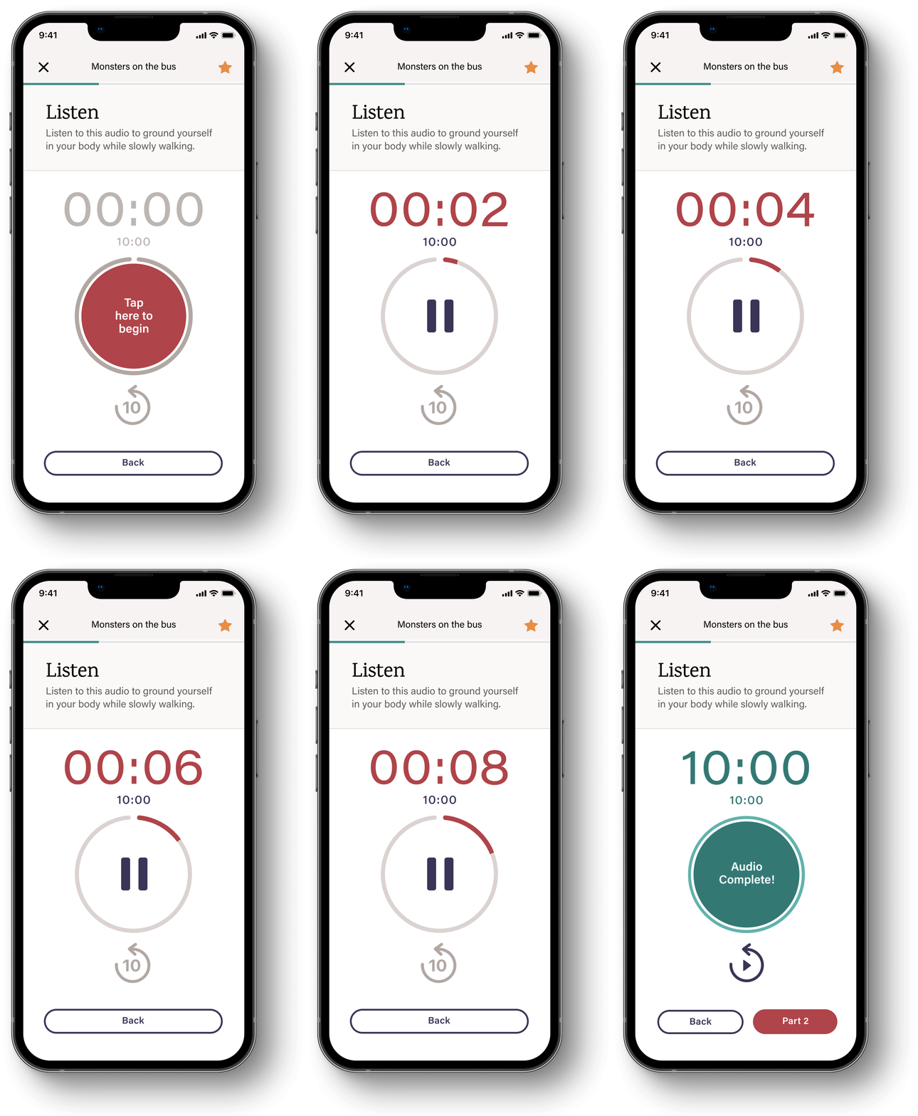
We made our decisions entirely based on our knowledge of fibromyalgia, our user/patient, and the clinical therapies that we needed to accurately represent within the app. The insights we gained from our research into understanding how, for instance, a pain flare-up or severe brain fog, has the ability to impact our user throughout the day, compelled us to design a UX and UI that would prioritize ease-of-use and minimize excessive interactivity and functionality. This was done to reduce the risk of overstimulation and potential adverse effects that could cause further pain.

Our approach
Co-creating an experience
The mental and physical symptoms of fibro are almost completely unique to each user/patient. It’s for this reason, that we approached the redesign of Tempo with an understanding that the most effective path to real individual treatment would be to design a product which is less concerned with providing a curated experience which funnels users inward toward a similar end-goal, but instead, funnels outward toward a variety of personal goals and tools that allow each user to achieve a quality of life which is uniquely suited for them.
Meet our user—Paula
The nature of fibro in relation to the symptoms experienced by patients is a very unique and individualistic experience, making it very tricky when attempting to speak directly to or on-behalf of—as well as visually represent—fibro patients. This is why, we decided to represent our users/patients through the use of a diverse variety of illustrated people.
In order to maintain a focused experience, Tempo caters to a group of one, and her name is Paula. ‘Paula’ is how we reference our users/patients internally only, and is actually never referred to by name within the app experience. This is because Paula represents many individual patients, and those patients have real-world names and uniquely different real-world interactions with the app.
Our goal with this style of representation was to be able to showcase fibro patients within the story and user journey while simultaneously respecting the unique and personal struggles of each.

Patient results after using Tempo V2
76%
no longer affected by clinical depression
Based on analysis of 37 participants with baseline clinical grade depression in a single-arm, prospective clinical trial.² Data on file.
74%
better sleep quality after using Tempo
Based on analysis of 40 participants in a single-arm, prospective clinical trial.² Data on file.
73%
improved well-being (up from 22%)
Data presented from a prospective, randomized controlled clinical trial.¹
84%
reported Tempo as easy to use
Based on analysis of 37 participants with baseline clinical grade depression in a single-arm, prospective clinical trial.² Data on file.
60%
no longer affected by clinical anxiety
Based on analysis of 44 participants with baseline clinical grade anxiety in a single-arm, prospective clinical trial.² Data on file.
88%
satisfaction rating after using Tempo
Based on analysis of 40 participants in a single-arm, prospective clinical trial.² Data on file.
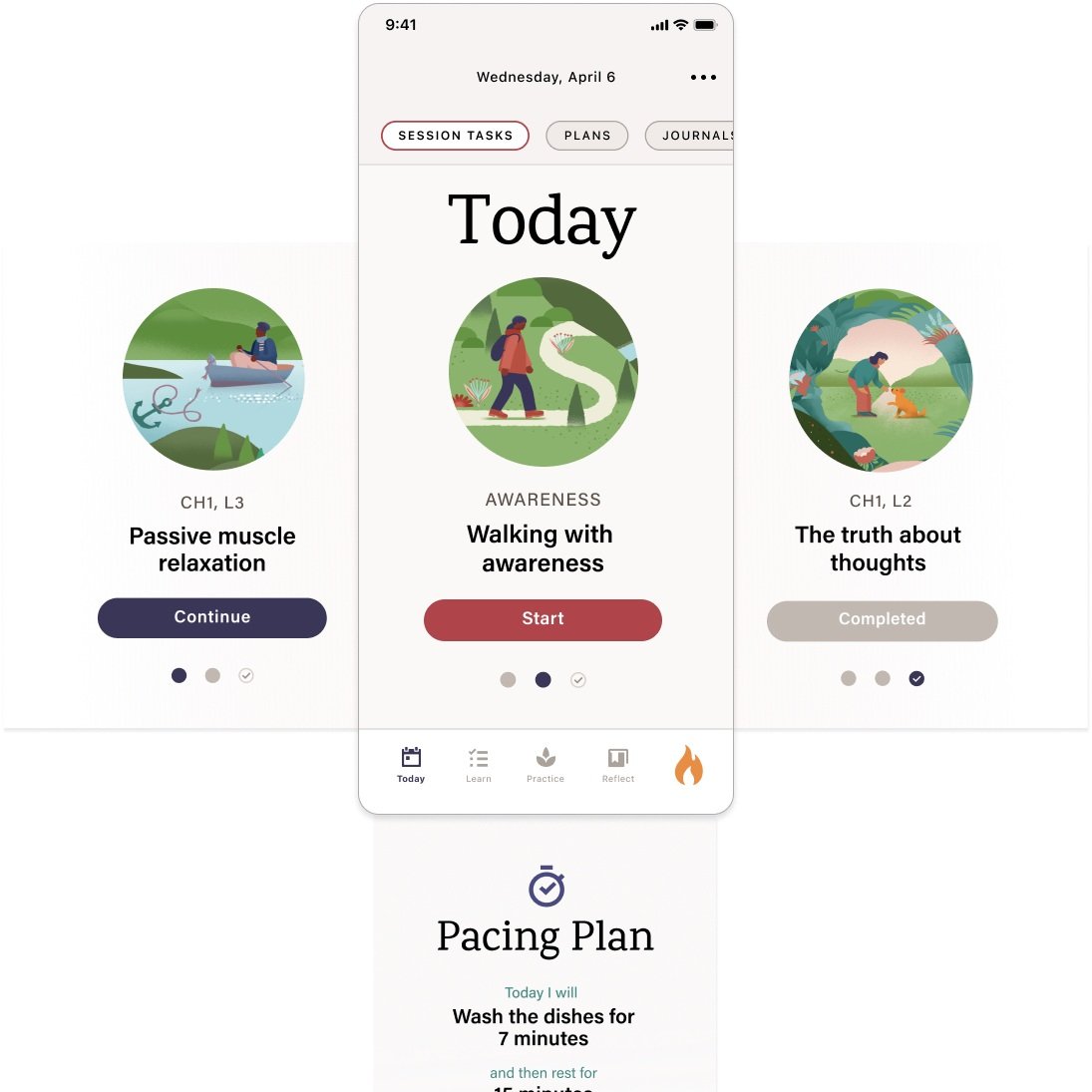
Starting with Today
The redesign of the Today screen aims to enhance user experience by prioritizing clarity and accessibility. By focusing on essential features, users can easily find and engage with daily lessons and activities. This streamlined approach not only organizes content effectively but also supports users like Paula in navigating their journey more independently. The intention is to provide an empowering environment where individuals can manage their experiences and build the necessary skills to cope with fibromyalgia.


Chapters & Lessons
Each illustrated scene corresponds to a chapter, and each chapter includes specific lessons, represented by a circular cutout within that scene.
As Paula completes her lessons and chapters, these circular lesson images serve as bookmarks, assisting her in navigating the app and keeping track of her completed chapters, achievements, and necessary new tools.


